Client system · Profit dashboard
CEO Profit Dashboard
Are we ahead of last month, and what should we change? One dashboard answers both, from net sales down to contribution margin, on data the client owns.
An Australian ecommerce retailer
Profit and loss dashboard
Like-for-like month view
Channel and product profit
Owned data, no rented tool
The dashboard, six views
Watch the dashboard in action
See how the CEO view turns sales, ad spend and margin into the decisions the founder makes each day.
1 / 6
The system
Every number the business makes, in one place
Shopify, Meta, Google Ads, costs and sixty-nine months of history flow into one place the client owns, and read as a single dashboard.
69
months of history, reconciled to the cent
2 hrs
of morning reporting, replaced
$10k
monthly ad spend cut, total sales flat
Automated sync
Four reports, assembled by hand, every morning
The founder ran four standard reports by hand every morning before the day could start. Exports, spreadsheets, cross-checking. Up to two hours a day, and once most of a day. "I might spend like two hours trying to get my reports coming out of there."
The question she actually cared about was simpler than any of the four reports. Are we ahead of last month, and what should we change? Getting an answer meant doing the comparison in her head on top of the numbers she had just assembled.
She was paying for a rented reporting tool on top of all that. Its numbers did not reconcile with Shopify's own records, so the day started with figures she could not fully trust.
Like for like
The numbers the CEO actually runs the business on.
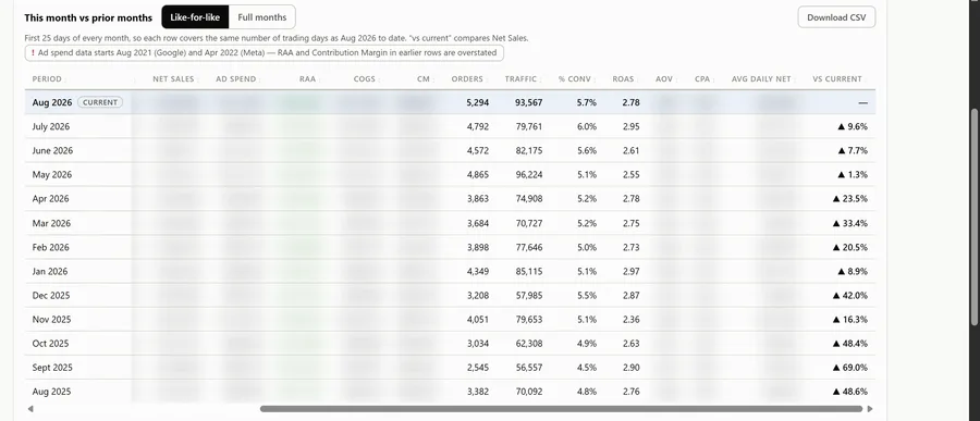
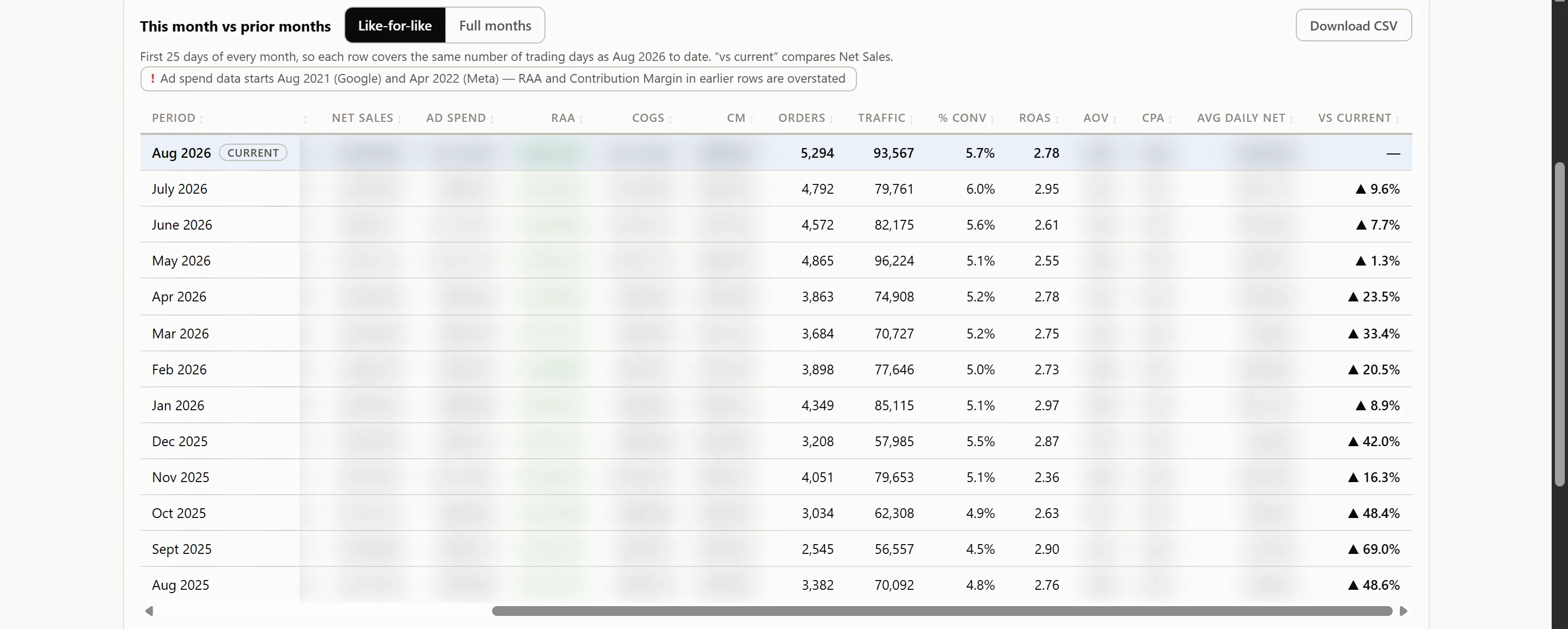
The view she asked for by name. The first days of this month against the same days of every month before it.
The VS CURRENT column marks every prior month up or down against where this month is tracking, so a longer month never flatters the numbers and a short one never looks like a collapse.
She reads it the way she used to run the comparison in her head: "comparing it to 28 days of June, 28 days of April…"
The table runs back through the store's full history, so no season is read on its own.
Like-for-like months · the live dashboard
What she looks at first
The whole month on one screen. The profit chain reads left to right, from gross sales down to what is actually left, and every tile carries its own movement against the period before, so a number is never read on its own.
Month to date, in two reads
The chain, in order
Gross sales down to contribution margin, plus the blended return on ad spend and the order count behind it.
1 / 2
The live dashboard, month to date · the profit chain
One period control
Month to date, ninety days, a year, all of it. Every tile and every chart on the page follows the same selector.
The chain, in order
Gross sales, discounts, returns, total sales, tax, then net sales, ad spend and contribution margin.
Movement, not just level
Every tile carries its change against the prior period and a sparkline, red or green, so direction reads before the number does.
The ratios that decide
What improved, and what needs attention
Level tells you where you are. Movement tells you what to do. Daily contribution margin sits beside the return on ad spend that produced it, so a good month that is quietly thinning shows up while there is still a month left to fix it.
Contribution margin, RAA and the ROAS trend · the live dashboard
Margin, every day
Contribution margin is drawn against the return that produced it, so a thin day is visible as a thin day.
A trend, not a verdict
Where the sales actually come from
Twelve months of channel mix on one screen, so a shift in where the sales come from shows up long before it reaches the total. Every channel sits on the same terms underneath, and the ones carrying ad spend carry their own return on it, so a busy channel and a profitable one are easy to tell apart.
Sales by channel, twelve months · the live dashboard
The mix, month by month
Twelve stacked months show where the sales came from shifting season to season, not just where they came from today.
Reporting tells you what happened. This tells you what to change.
The decision
Weak spend shows up in red. Then it gets cut.
Every ad set is measured against the point where it breaks even, worked out from the real margin of that period, and the line is printed above the rows for everyone to see. Anything under it turns red, and it stays red until someone acts. The dashboard did not make these calls. It made the losing spend impossible to miss, and the decision stayed with her.
Ad sets, where spend gets cut · the live dashboard
$400→$200
Products
Which products actually make money
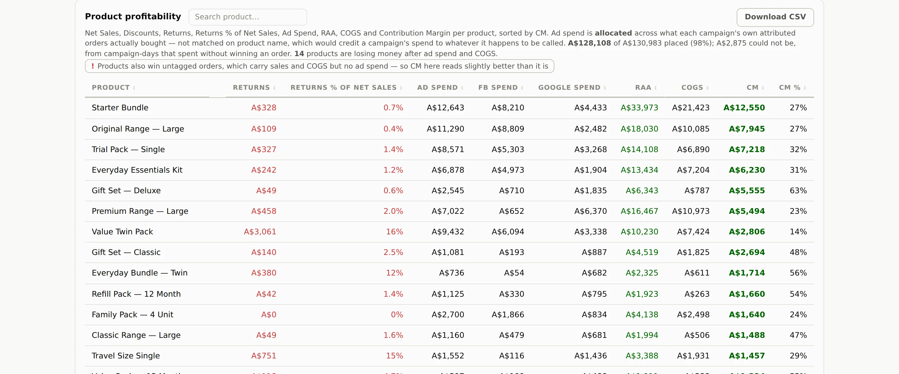
Contribution margin per product, after its own ad spend and cost of goods. The spread is wide, and it is rarely the spread the founder expects.
Fourteen products lose money once ads and COGS are counted against them. The dashboard says so in plain text on the table itself, so nobody has to go looking.
Returns sit in every product's row, so a strong seller that comes back often stops reading as a strong seller.
Each product's margin is read after its own ad spend and cost of goods, not before them.
Product profitability · the live dashboard
Owned data underneath
Every number starts in the client's own accounts, moves itself into one place they own, and stays there. No rented tool in the middle, and no subscription holding the history hostage.
The platforms
Where the business actually happens, and where every figure originates.
ShopifyMetaGoogle AdsThe routine
The numbers move on their own. Meta and Google land every morning, Shopify in real time.
n8n
What it changed
The morning routine is gone Four hand-assembled reports became one dashboard that is already current when she opens it. Up to two hours a morning went back to running the business.
The rented tool was replaced The client ended her Triple Whale subscription in favour of this dashboard. "we just paid Triple Whale the other day, if we can pass off them before the next payment that'd be great." Its numbers never reconciled with Shopify's actuals. These do, to the cent, across all sixty-nine months.
Weak spend got cut One product's daily ads halved from $400 to $200. An ad set losing roughly $75 a day was killed. A deliberate $10,000 cut to Google spend left total sales flat.
The history is an asset now Sixty-nine months of history live in the client's own account, checked to the cent. Leaving a tool no longer means leaving the data behind.
Who this system is for
This build fits founders who recognise their mornings here.
Ecommerce founders assembling the same reports by hand every day.
Operators paying for a reporting tool whose numbers do not match their store.
Brands spending on ads without a per-product or per-ad-set profit view.
CEOs who want to know if they are ahead of last month without asking anyone.
Teams who would rather own their numbers than rent them.
Still building your own numbers every morning?
Tell us what platforms you sell and advertise on, and we will show you what an owned profit dashboard looks like on your data. Built on what you already use, owned by you, with every figure tied back to the source.