Growth Playbook
The weekly reporting cadence that ends "how are we doing?"
A teardown of a reporting system that has run for a real client for a year and a half. The actual Monday emails, the actual Friday reports, the Slack thread where a number got challenged, and the workflow underneath.
DashboardLim · Systems desk
2026-06-177 min readThis is not a framework post. Below is one real week of a reporting system that has run for one Australian financial-services client, the same client behind our sales dashboard case study, since early 2025. The week of Monday 3 to Friday 7 August 2026, told through the artifacts it produced.
71
dated weekly reports in the folder
18 mo
and still running
23
workflows on that automation instance
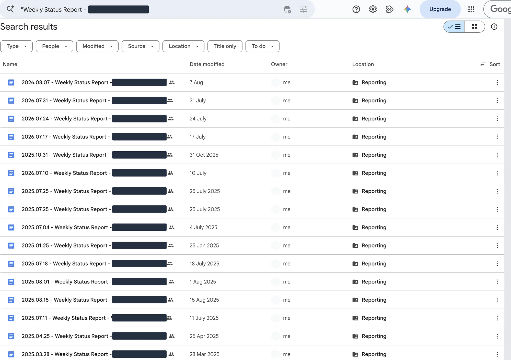
Every screenshot in this issue is a real capture from the live systems, taken while writing it. Names, contact details and dollar amounts are masked, and some shots are cropped for readability. No values or messages were rewritten.
Saturday 1 August
The week opens with a challenge
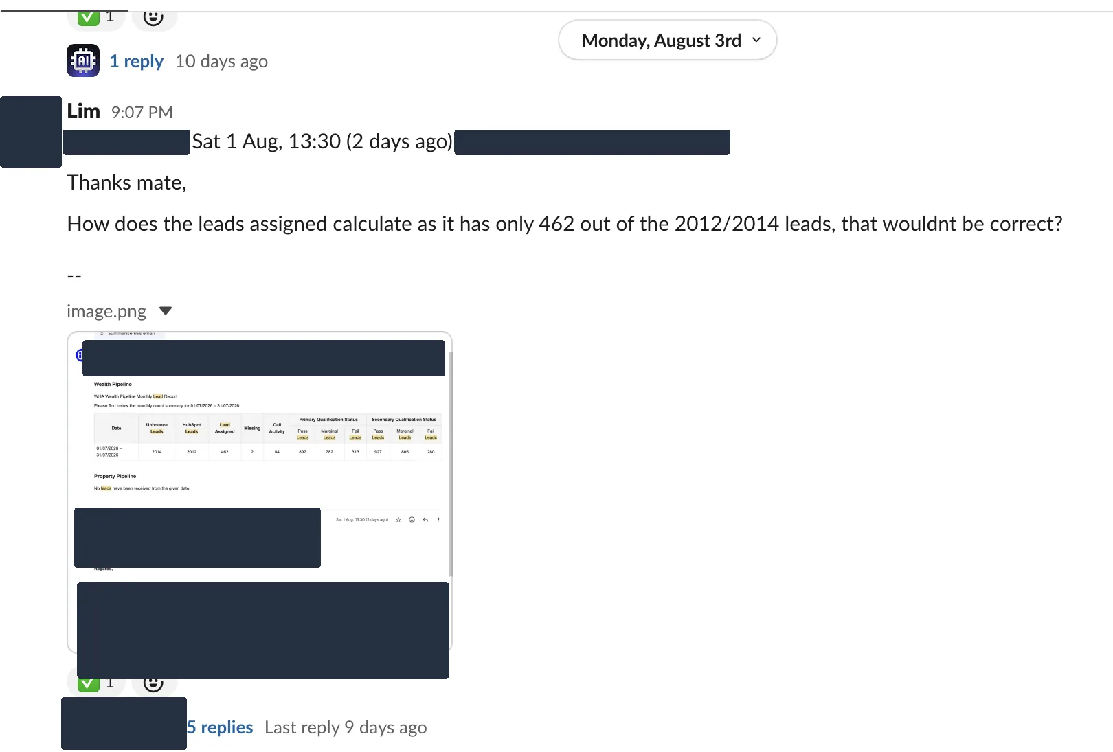
A reporting cadence earns trust the first time someone pushes back on it. On the Saturday before this week, the client's founder replied to the monthly lead report. The "leads assigned" figure said 462, out of roughly two thousand leads. That looked wrong to him, and he said so, politely and in writing.
The reply was posted into the shared Slack channel on Monday and worked in a thread, five replies long, until the calculation was explained and the tick went on. That is the whole point of reporting on a schedule. The question landed on a number everyone could see, instead of turning into a meeting about what the numbers even are.
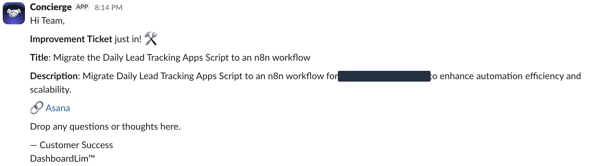
Requests travel the same road. When the client asks for a change, someone types "raise a ticket here" and a bot logs it to the task board and posts the ticket back into the channel, like the one below. Two weeks earlier, a request about how dead-end leads get marked became a tracked ticket the same evening it was raised. It shows up again in this week's Friday report. Chat is where things surface; the board is where they live.
Perfect systems are decoration. This one gets questioned, corrected and extended in the open, which is exactly why the client keeps reading it.
Monday 3 August
Monday starts with an email nobody wrote
On Monday morning, before the workday started, the week's schedule landed in the client's inbox. Every meeting booked for 3 to 9 August, who is running it, the client on the other side, and the borrowing-capacity position behind each one. The subject line carries the week and the count.
Nobody assembled it. A workflow reads the tracker the team already keeps, shapes it into the same table every time, and emails the people who run those meetings. When bookings move, the report sends again with an updated count. The second row in this list is exactly that. Monday's thirteen meetings became Tuesday's nineteen. The report is there before the week's first check-in call, so the call can be about decisions instead of collecting numbers.

What to look at
- The subject line does half the job. "This Week (Aug 3 - 9) - 13 meetings" is readable from a phone lock screen.
- The table is the client's own tracker, reshaped. No new tool, no new habit to learn.
- When the week changes, the email follows. Nobody has to ask for the latest version.
Thursday 6 August
By Thursday, the client is grading the machine
On Thursday, the client's operations coordinator sent her testing notes on the notification work. The verdict, verbatim. "All good on the received email notifications. No duplicate emails were received and the generated lists are correct."
This is what the cadence is for. The reports do not just arrive. The people they serve check the machinery and sign off its behaviour in writing.
Friday 7 August
Friday answers what Monday asked
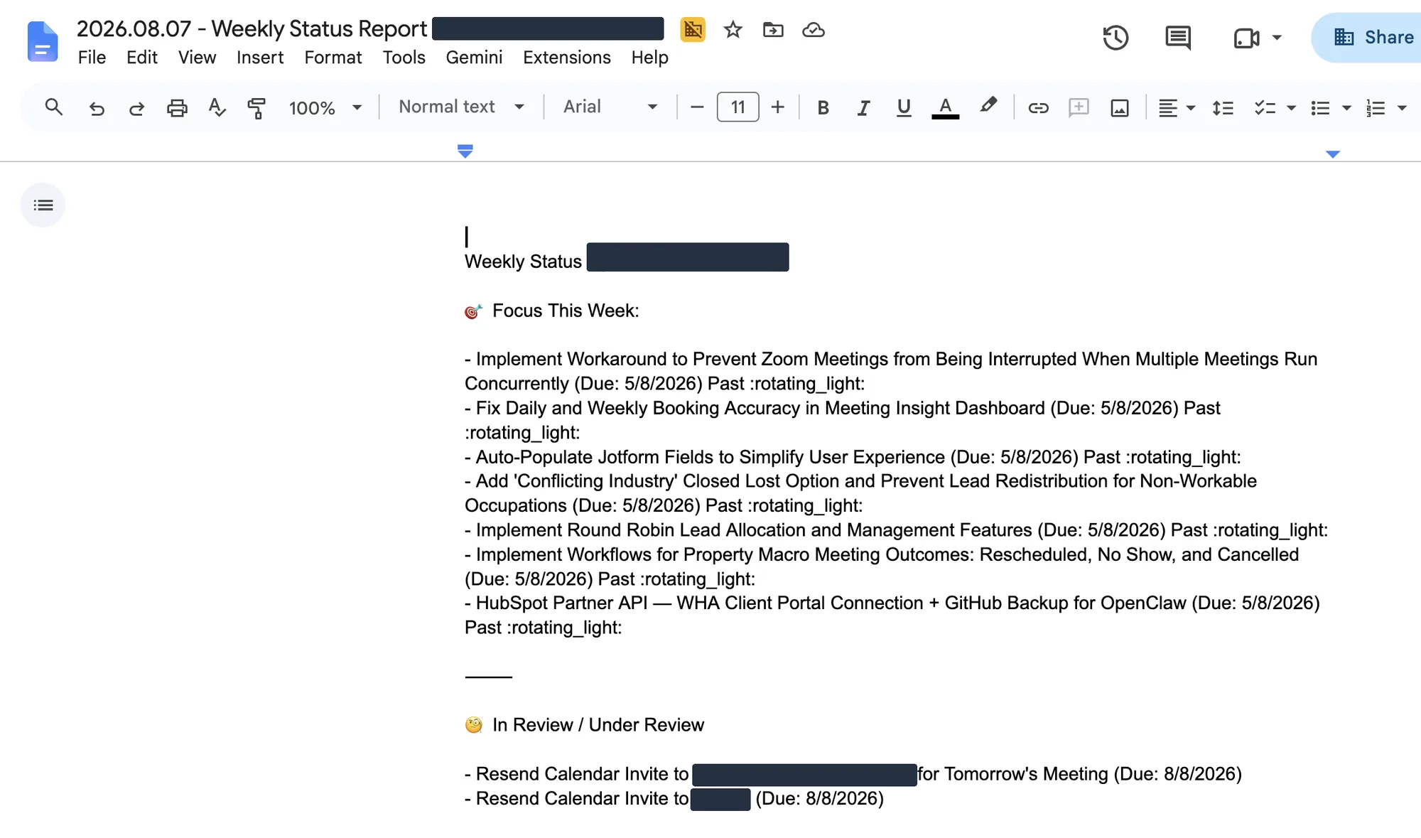
Monday showed what was scheduled. Friday shows what happened. The status document for the week appears in the client's shared Drive folder, on a Friday schedule so consistent that the folder's timestamps agree to the second. Seventy-one dated reports span the last year and a half.
The shape never changes. Focus This Week. In Review. Key Wins. Next Week. The delivery team owns the words inside it, which is the part that should never be automated. Machines are good at collecting the week. Deciding what it meant is a human job.
Late on Friday afternoon, four more emails closed the week, one for each pipeline. Discovery, 35 meetings. Strategy, 16. Property Macro, 18. EOI, 5. The meetings the week opened with now carry outcomes, and nobody compiled anything by hand.
What to look at
- Overdue items carry a flag and the word "Past". Slipping work is reported, not quietly dropped.
- Fourth item under Focus This Week is the ticket raised in that Slack channel, eighteen days earlier. Raised in chat, tracked on the board, reported on Friday. The loop closes in writing.
- The Key Wins section reads NA this week. Not every week ships something, and the report says so.
- The outcome emails go to the teams who ran those meetings, the same afternoon the week closes.
Monday made promises. Friday accounted for them. That is the whole rhythm.
Underneath
The machinery is boring on purpose
There is no exotic platform under any of this. The client's tools stay where they are. An n8n instance on their own infrastructure reads from them on a schedule. Monday and Thursday for the meeting reports, daily for the lead counts. It shapes the data, sends the emails, and logs every run to a health tracker that a human actually checks. The Friday status document keeps the same weekly rhythm in the shared folder. The document above is the evidence for it, exactly as the client reads it.
This is the workflow that sends the Monday report. A schedule trigger, a sheet read, a formatting step, a Gmail send, and a logging tail. Two deactivated nodes are still parked on the canvas from an earlier version. Real systems look like this.
It is not flawless, and that is worth saying out loud. When we took these screenshots, the instance's own dashboard counted 2,504 successful runs against 322 failed ones across every workflow it hosts, not just the reporting ones. The difference between automation you trust and automation you babysit is not a zero failure rate. It is that failures land in front of a human instead of hiding.
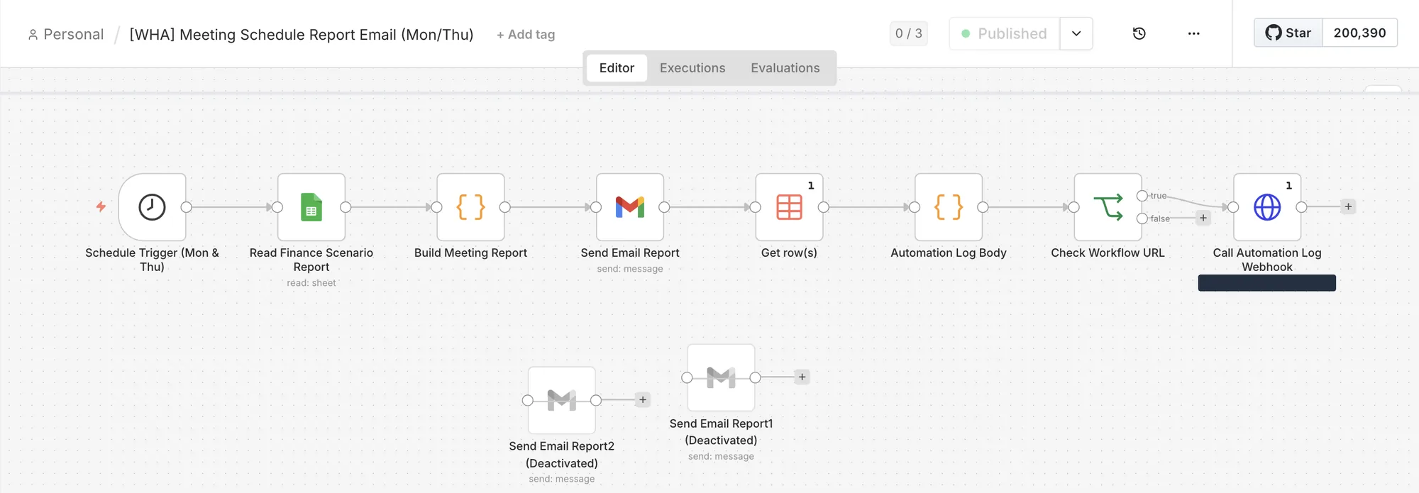
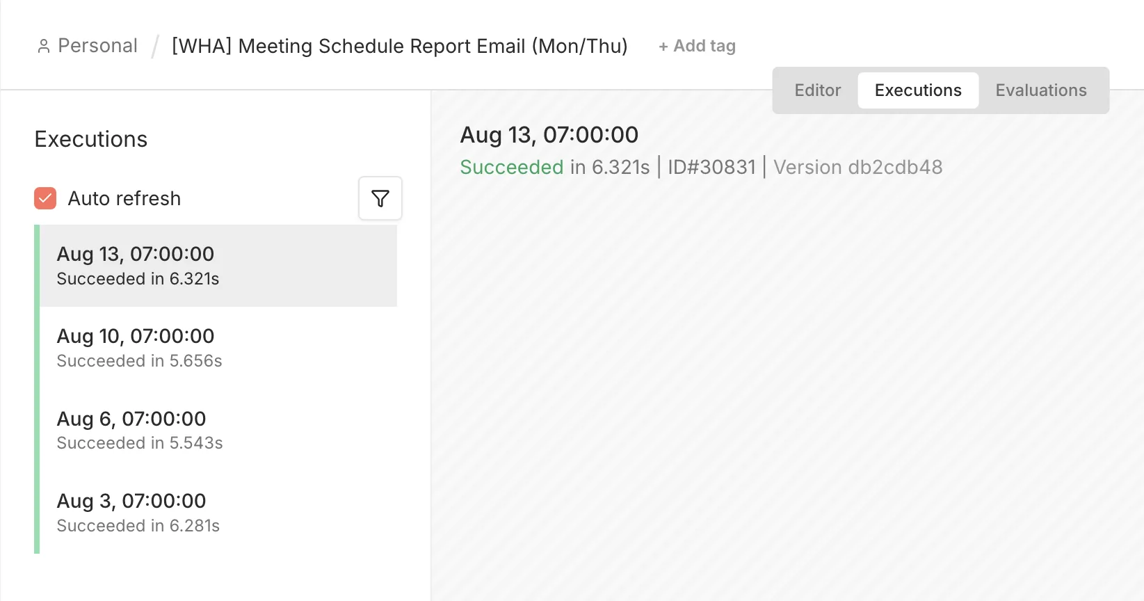
That is the whole architecture. The client's own systems, one scheduler that reads from them, email and Drive as the delivery surface, and people making every decision. The dashboard from the case study below is where they go to look things up. The cadence is what shows up without being asked.
Steal the shape
You can install this rhythm with the tools you already have. Start thin and defend the schedule.
Pick your two anchor days
Open the week with what is scheduled and due. Close it with what happened. Monday and Friday work; any fixed pair does.
Fix the format before you automate
Same sections, same order, every time. The Friday report above has not changed shape in over a year, which is why nobody has to relearn how to read it.
Name an owner for every number
A person, not a team. When someone challenges a figure, the way the founder challenged the 462, the question needs a desk to land on.
Automate the assembly, not the judgement
The machine collects, shapes and delivers on schedule. People write the narrative, make the calls and answer the challenges.
Give exceptions a path
A flagged number or a client request should become a tracked ticket within the hour, and its outcome should reappear in Friday's report. Chat is where things surface, not where they live.
Send it before it is polished
The first versions will be thin, and the overdue flags will show. Send them anyway. The reports above earned replies, questions and fixes because they arrived every week, not because they were pretty.
The proof behind this issue
The reports in this issue belong to the same client engagement as this case study. The dashboard is where the client goes to look things up; the cadence below is what arrives without anyone asking.
Case study
· Sales performance dashboard
Sales Performance Dashboard
We replaced scattered sales reporting with a single live sales performance dashboard — every deal, stage, agent and automation signal in one screen, in real time.
7
live dashboard views
4
pipeline stages tracked
Real time
data read on every load
 JotForm
Get the next issue in your inbox
Real systems we've shipped, with practical lessons you can use today.
What question does your team keep asking?
Tell us the question that comes up every week, whether it is "how are we doing on leads" or "what actually shipped". We will show you the reporting flow that answers it before anyone has to ask.
Keep exploring the Intelligence Library
Workflows
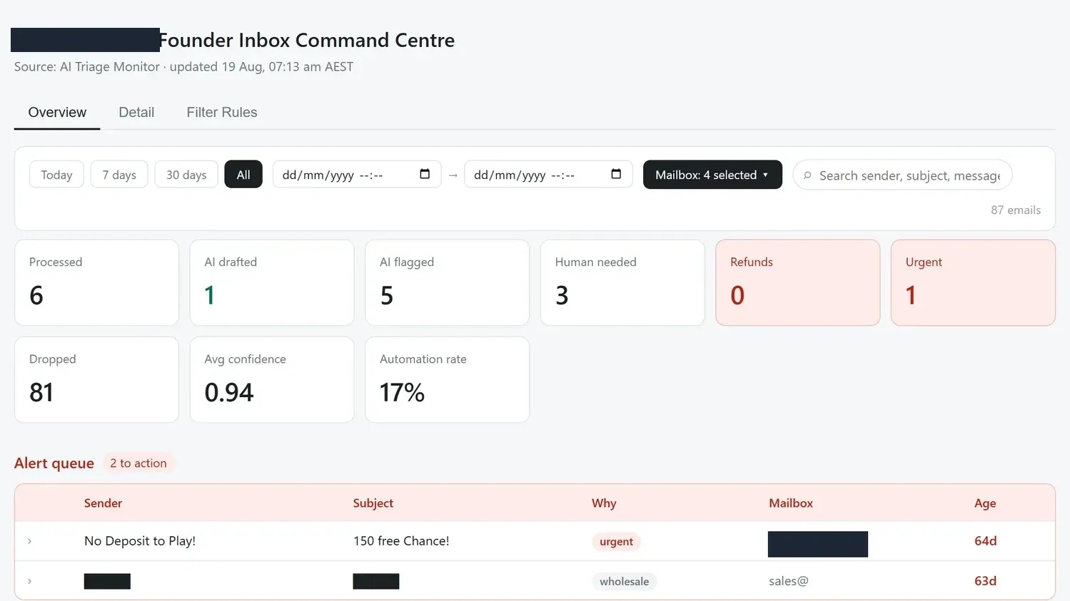
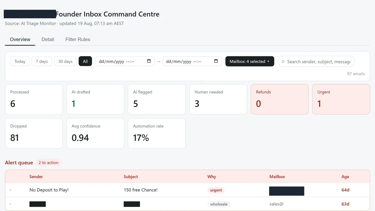
Three systems to install before Q4 planning
2026-07-01
Reporting & Dashboards
Agency360 Product Update
2026-06-03
Reporting & Dashboards
Inventory Forecast Dashboard
2026-05-28